


UNLOCKED - AMD Chart Review 🤔
Is This a Stock to Trade?

I’m going to start a little free series here where I review a chart from a popular ticker a couple times a week and explain what I see. Hopefully, it will be instructive for how to trade and give you an idea of what I look for when I’m evaluating a potential trading candidate! Let’s get going! 🎉
AMD - A Value Chip Story
AMD 0.00%↑ is better known as the Red Headed Stepchild of Chip stocks, always the cheaper version of NVDA hardware. NVDA is like the cool, brand name stuff you can wear, but AMD is more like going to Wal-Mart for clothes. As a result, AMD doesn’t get near the attention that NVDA gets. 😒
Weekly Chart Review 📊
I always start with a weekly chart when I am evaluating a setup or potential trade. Why? Because the weekly chart shows me the trend. I like to trade stocks that are either in an uptrend, or in a downtrend that has a high probability of reversing. I don’t like to trade anything that is in an uptrend and very overbought or in a downtrend that is just getting started.
So - is AMD in an uptrend? 🤔The answer to this is no. I use a simple criterion to define an uptrend and that is positive momentum. My momentum indicator is in the middle clip and it’s < 0, so the trend is still down for AMD.
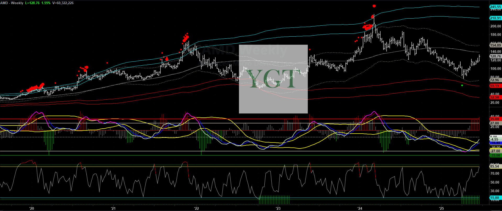
So - is AMD oversold on the weeklies and due for a rebound? Absolutely, but that rebound has occurred and is long in the tooth. 🦷 I use two things to determine if a stock is setting up for an oversold bounce. One would be the presence of Green Dots under the bars of the chart. The second would be the presence of green bars in the bottom clip.
We are currently still seeing Green Bars in the bottom clip. So, technically it’s still showing a tendency to revert to the mean (e.g. rally off oversold conditions). But, since the rally has definitely occurred and is reaching almost 12 weeks in length now, the stock is reaching a point in time where it is natural to take profits off a long trade. 😁😁🙌
How do I know it’s time to take profits off a long trade? Well, the third clip is an oscillator I like to use and it’s reaching overbought conditions. That tells me it’s time to wrap up longs and head on to the next setup.
Daily Chart Review 📊
What’s the Daily Chart look like for AMD? Well, it looks like we are hitting a resistance level here, reflected by the Grey Line. This is another sign it is time to take some profit on a long trade.

We see a Red Hump in the first clip under the price action. That’s a sign it’s time to take profits on the Daily Chart. Notice there were Green Dots, as well as Green Humps and even Green Bars in the Bottom Clip. Those would be setups for Long Trades on the Dailies.
So, What’s the Bottom Line? 👀
The bottom line is that AMD has had a great rally off the lows, but that rally has reached a point in time where some profit taking should naturally occur. Does that mean AMD is going to sell off and you should short it? No, not really. I’d look for a better setup than this one if I wanted to short something. Stocks are not always in a position to trade - in fact often times they are in between, and you need to just wait for a new setup to occur.
Hope that helps! 💪 I use setup like these to identify trading candidates for Subs every day! If you want more setups like this, consider a sub!
YGT
Disclaimer
This post is not financial advice, it’s made for educational and entertainment value/purpose. Trading is hard, investing is hard - there is substantial risk you could lose a lot of money. Any track record or performance shown here is purely historical and could change in the future - past performance is not a guarantee of future results. While the writer attempts to present information as truthfully as possible, author can’t be held responsible for any errors or omissions in the content of the posts and cannot be held responsible for how you use the information presented in the posts. Content here is property of You Got This Trading LLC unless stated otherwise. All rights reserved.