

📉Weekly Update - Every Major Sector is Down Except for Tech
Weekly Blueprint for Success for May 9th

Welcome to the weekly report! This report is targeted at investors that don’t have time to monitor the ebbs and flows of the market day to day and still want to beat the market and avoid bear markets🚀. Just 10 minutes a weekend is all it takes.
I focus on the MAJOR themes and the MAJOR trends of the markets in this report. All the models I present are back tested with results so you can see that they work🤔.
This post is long - so make sure you read it on the Substack App or Website so you get to see the bottom of it - Email can often cut the message short. Let’s get into the weekly models!
What Happened This Week
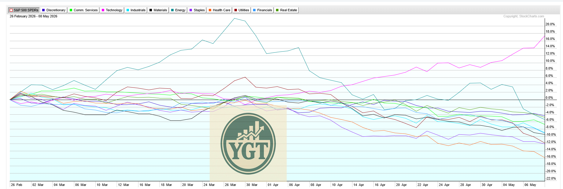
This week we reached a fever pitch in the AI and Chip trades. A handful of stocks went absolutely off the rails to the upside unlike almost anything we’ve ever seen. It sounds hyperbolic to say something like that, but it’s true.
Since the Iran War has started, every major Sector (INCLUDING ENERGY STOCKS NOW) is down except for one. One sector. Look at this discrepancy - it’s incredible. Tech is that pink line at the top, the rest of them all under 0 and falling.
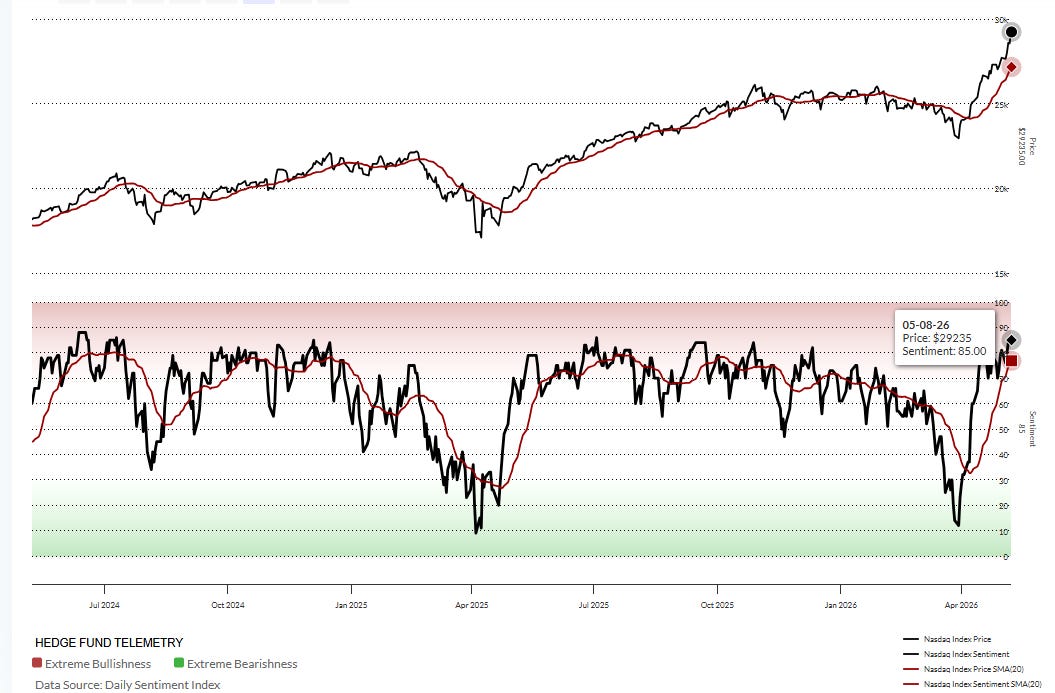
The Euphoria is causing sentiment to get heated despite most stocks actually not doing that well. Jake Berstein’s DSI (Daily Sentiment Index) is hitting 85 now. This is an unsustainable level and almost always results in an intermediate term top. Waiting for sentiment to get reset at the 50 level is a good idea.
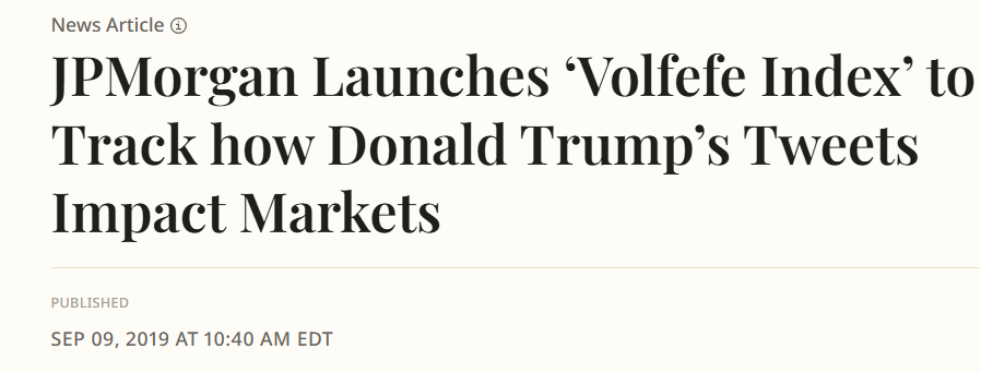
This has our favorite guy up there cheering like he used to do back in 2017-2019. Back then, JPMorgan started tracking his Tweets and using Machine Learning to predict which ones would move markets. Doesn’t that sound so…outdated now?
Sentiment is absolutely shredded here. Honestly it reminds me a lot of the country right now - about 10% or less of folks absolutely out of their mind happy and the rest of it sitting on losses for the year and getting worse.
Even Tech Isn’t That Great
Within the Tech Sector itself, things aren’t that great. Look at the breadth. The % of Stocks in Long Term Uptrends in the XLK is < 60%! Waning breadth like this is a feature of Major Tops and we are putting in pretty much Text Book behavior here.
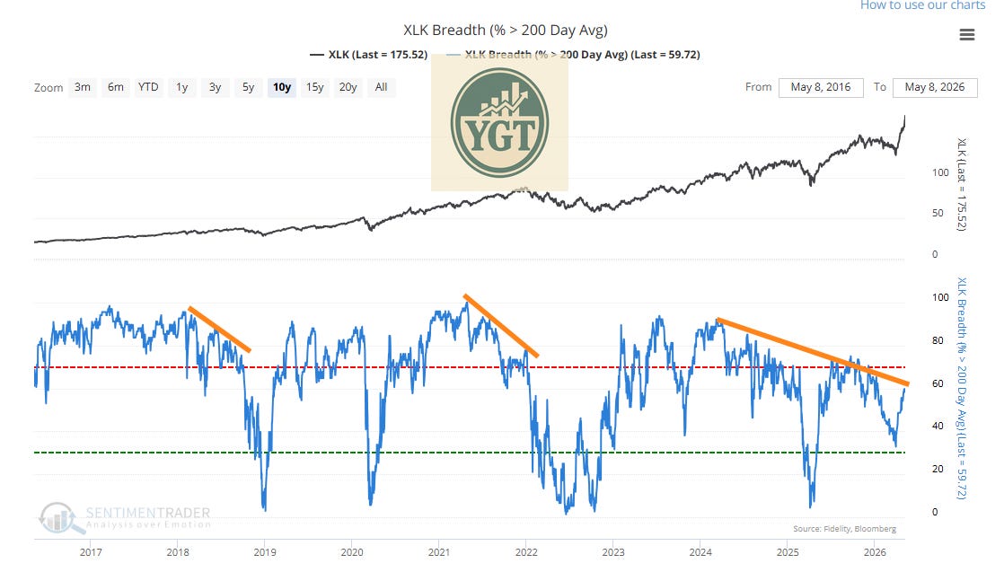
It’s thin. We are dancing on the head of a needle here.
Gas Prices
We showed this chart last week with support and resistance outlined. This is the ETF that tracks the Oil Markets.
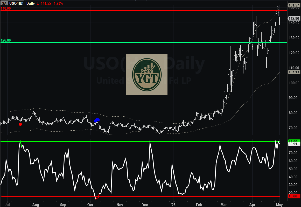
Where did we bounce this week? Right at the Green line. Not bad! It’s almost like Gamma Profiles work or something.
Winners and Losers
Losers this week included:
Oil and Energy (Iran “Deal” Hopes)
Utilities (Rates Lower Hopes)
Defensive Sectors such as Healthcare and Staples (People selling anything in their accounts to chase Tech stocks)
Winners this week were same as last week:
Korea (Bubble Mania)
Semis (Bubble Mania)
Tech (Bubble Mania)
Gold and Silver (Sentiment Very Low, Nice Long Setup)
Weekly Show and Tell
Each week I review a chart or model that I would normally keep behind the paywall, I hope you can make a couple bucks off of it! 🤑
Last week, we said it looked like the Mega Cap stocks would wake up and start carrying water and look what happened. AAPL jumped up and started running - it went up almost 5% last week.
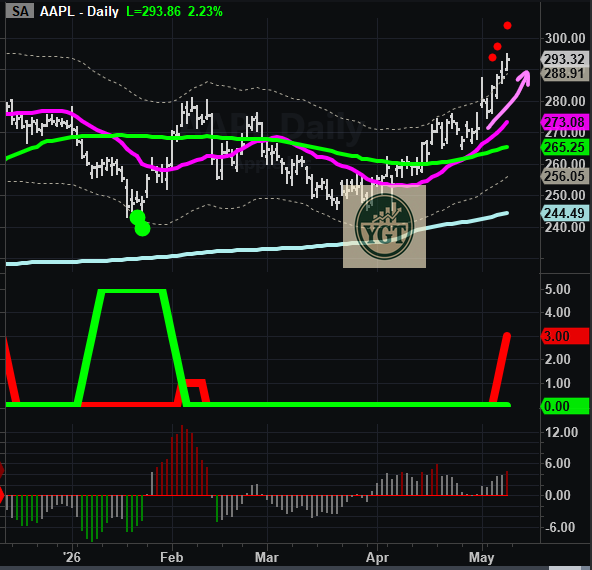
It’s overdone now and we can expect some chop or a pullback over the next couple weeks.
Today, I want to review Sentiment. Specifically, as it related to the 2000 Dot-Com Bubble top. We are unfortunately here now. We are recording the worst, most prolonged spike in sentiment that I think we have seen in perhaps 50 years. At least since we’ve been using Options to trade meaningfully.
Let’s unpack this chart. This is the One-Month average of the SentimenTrader Optix index. SentimenTrader rolls up a bunch of metrics and provides a daily score for Sentiment. It’s a very nice little indicator. This is the only other time we’ve seen the One-Month average get like this. It was the run up to the Dot-Com Top.
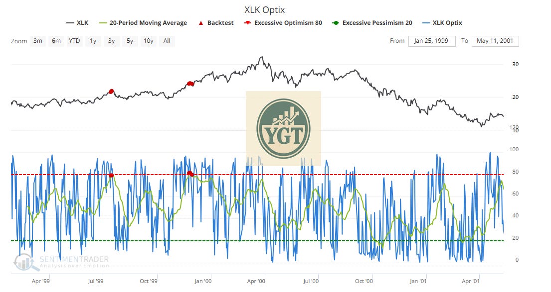
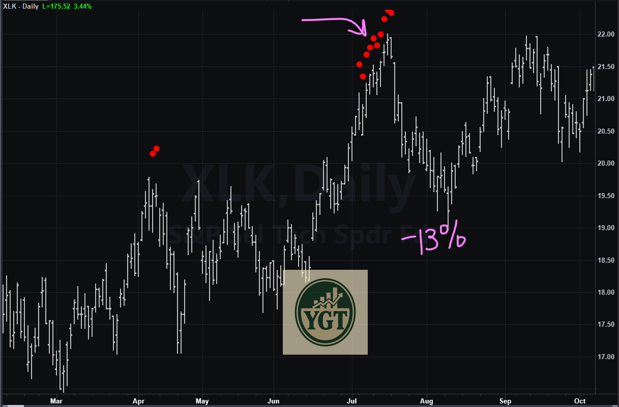
The first signal came in July of 99’ - we were full-blown melting up at that point in time. You know what happened to produce that little selloff right after the Red Dots? Hot inflation data.
It doesn’t look like much if you look at that chart, but it was a -13% down move from Mid-July 1999 to Mid-August 1999. How would that feel to you if we got one of those now? Pretty damn bad I bed.
At that time the rest of the market (e.g. non-Tech) had peaked. Just like now. Everything is going down (we just reviewed that at the beginning of the note). But some people think it’s bullish to see stocks like INTC going parabolic. It’s not. It’s terminal Cancer most likely. Sad to see.
The second set of Red Dots you see up there was the Holiday Run going into December of 1999. At that time the only thing on anyone’s mind was Y2K. For those that don’t know, that was one of the stupidest times in the history of humanity (although right now is getting up there). Everyone got all excited that computers would stop working because the date systems were engineered such that when going from 1999 > 2000 they might revert back to 1900 again, which could cause all hell to break loose. Of course, nothing bad happened. I remember it vividly.
The final push to the Dot-Com top went up 34% in the following 4 months. Could we do that again? Maybe, but I doubt it. And remember, we were trading at the same price we were when we got those Red Dots at the end of January 2000. So that 34% run came from the end of January to March 2000. That was 34% in just 2 months.
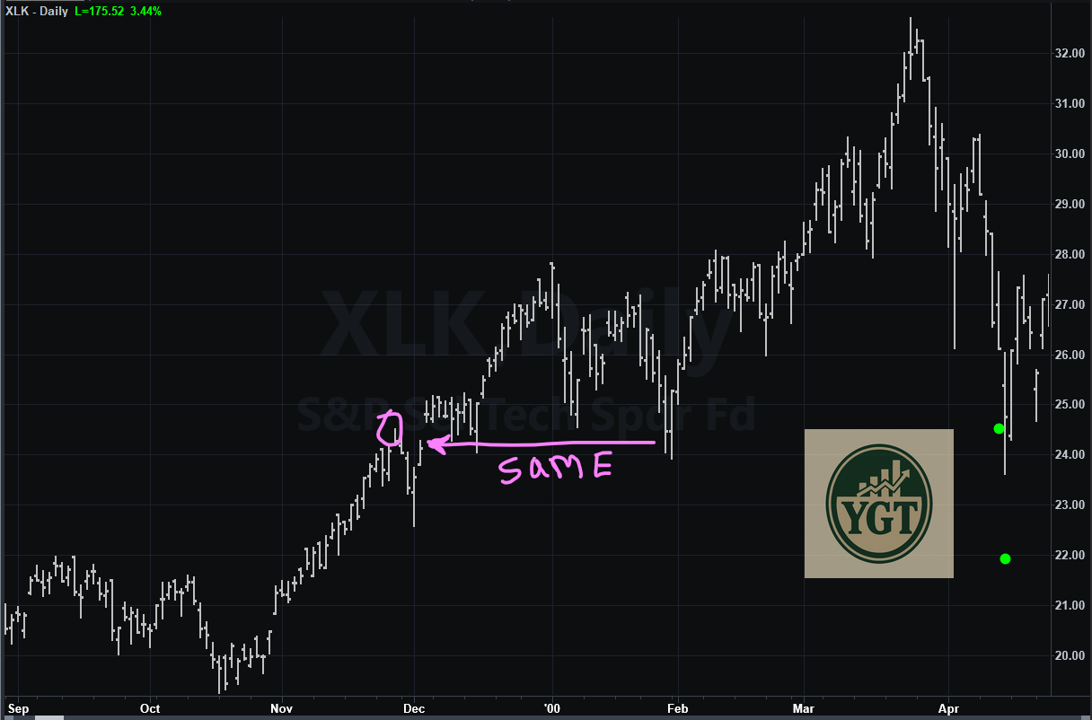
My point with going through all this is to let you know, we are there now. I don’t care about Fundamentals for INTC or that the US government owns them, or that OpenAI actually has revenue or that SpaceX has an IPO, etc. I care that charts are showing me it’s the same.
How’s it all going to fall apart? Well, instead of making it super complicated, maybe we just look to the past and figure it’ll end the same way it did the last time we did this. Inflation from the Oil Shock induced by the poor decision to go to War with Iran causes a recession and Fed has to raise rates to combat it, and it bursts the Bubble.
I don’t know if the new Fed guy Warsh will be capable of doing that or not - he’s a team player for Republicans and married to an heiress to Billions. Lower rates, easy money, borrow, borrow, borrow is literally tattooed across his forehead.
If we end up seeing the Fed turn into a puppet of the Executive branch, it might cause Weimar style inflation if the rest of the world dumps US bonds or the currency crashes. The 2nd order effects of that kind of thing are difficult to really predict. We’ll get plenty of signals before it happens though, that’s for sure.
And honestly, you don’t have to worry about it. If you use a simple trend following system like Our Weekly or Daily Trend Models, you will not take a huge drawdown when the tide turns. That’s what I’m focused on. Until then, we party on like it’s 1999.